
á la card
Conceptual Project
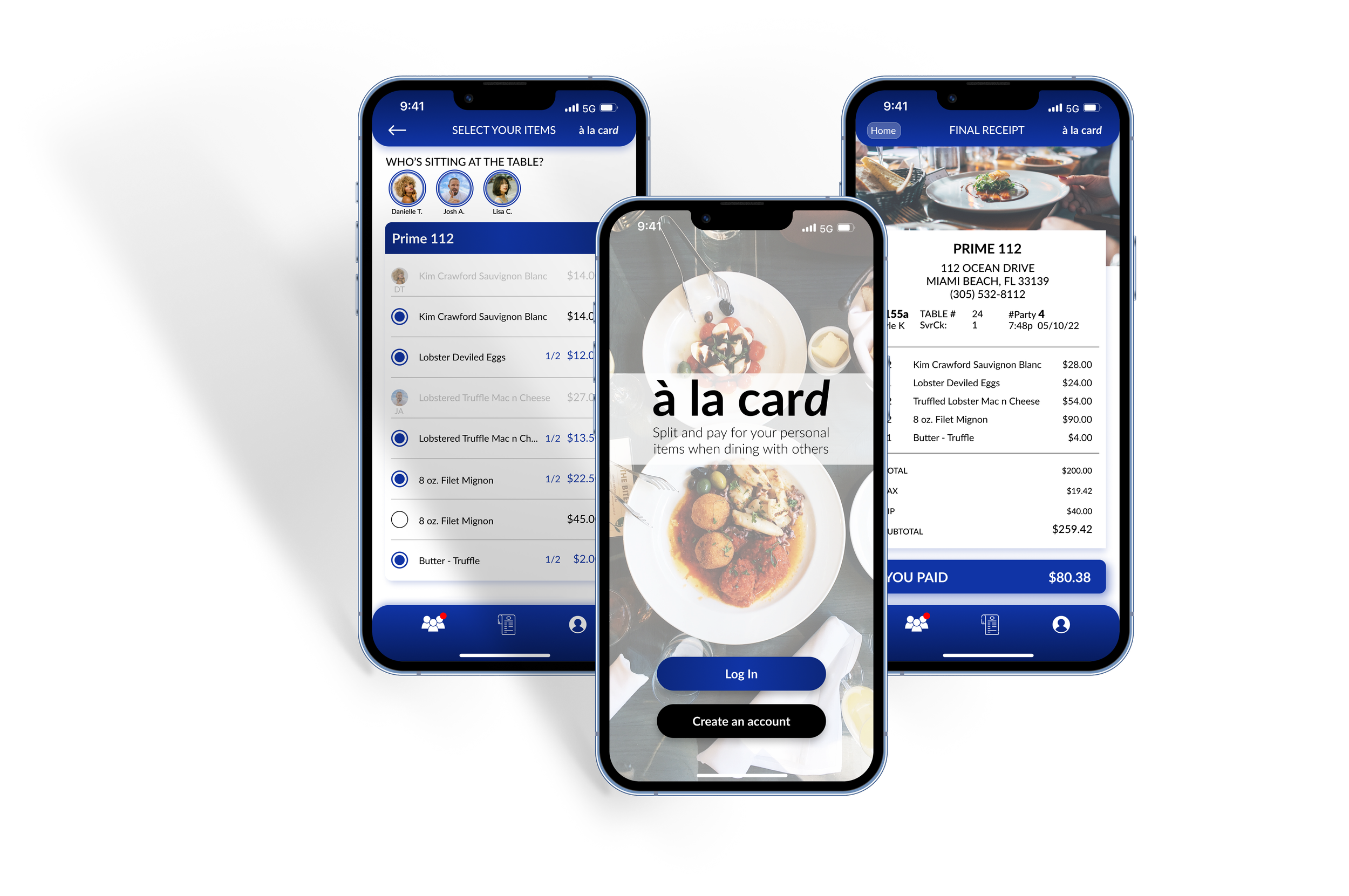
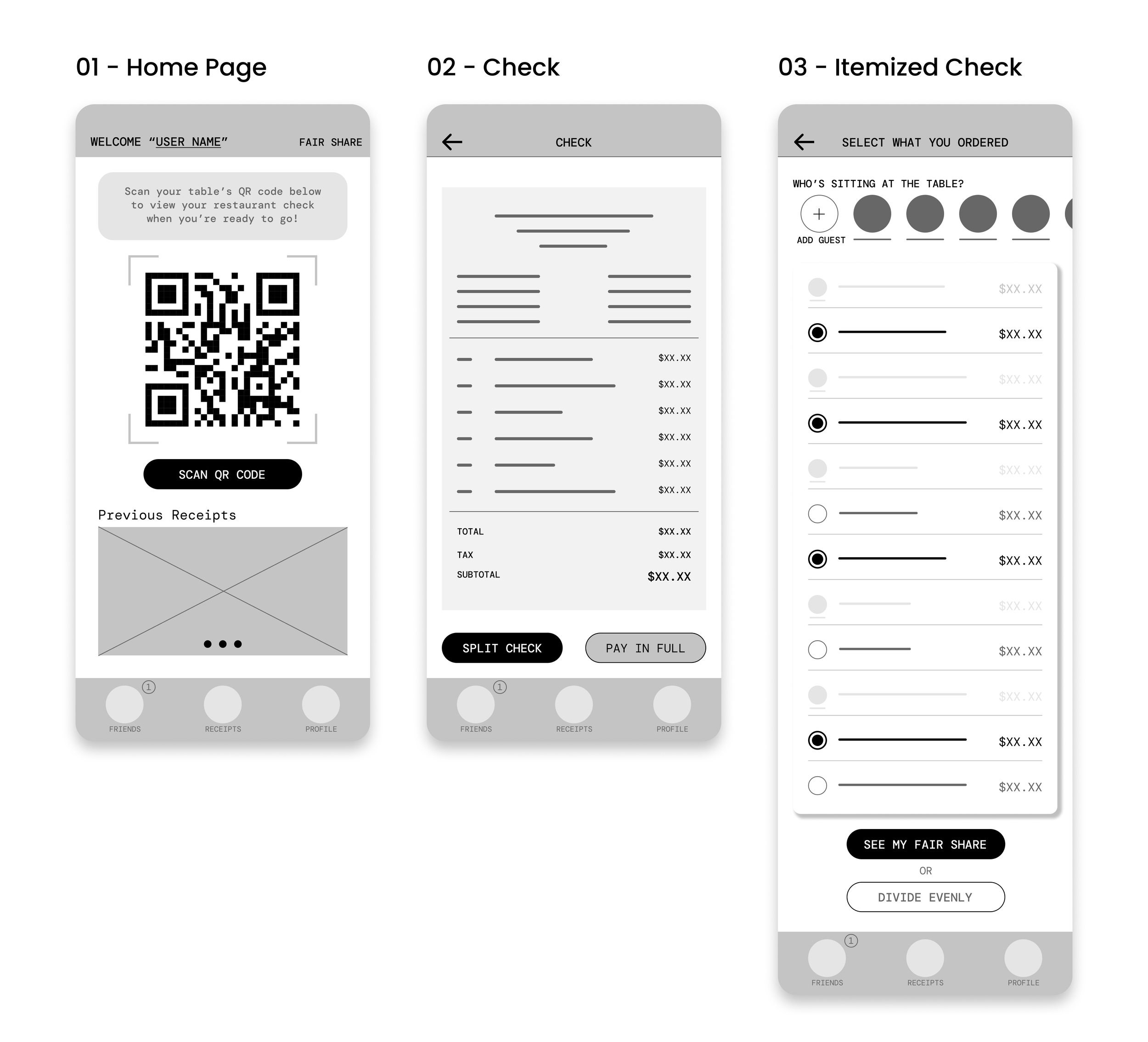
Á la card is a mobile payment app aimed at enhancing the dining experience for customers and boosting operational efficiency for restaurants. The app allows users to scan their table's barcode, select their individual items, and pay directly from their mobile device, streamlining the payment process for group dining.
Role: Sole UX Designer
Platform: Mobile App
Duration: 6 months
At A Glance
Challenge
This project addresses the common challenges users face during group dining, particularly the awkwardness and discomfort that arise when it's time to split the bill. Many users find this process confusing and stressful, leading to negative dining experiences. The solution focuses on streamlining the payment process by allowing users to pay only for the items they ordered. This approach not only speeds up the checkout process but also creates a more comfortable and hassle-free experience, ensuring users can enjoy their meal without the worry of navigating group payment logistics.
Goal
The goal of this case study is to design an app that simplifies and streamlines the process of splitting group bills. By allowing users to select their individual items and pay their portion of the check directly, the app eliminates the confusion and inefficiencies often associated with group dining payments. This solution aims to enhance the dining experience by making the payment process quick, fair, and stress-free for all users.
Outcome
Á la card was designed to improve how users and their friends split the bill at restaurants. The app aims to eliminate the hassle of dealing with awkward calculations and endless disputes over who owes what. Users will no longer have to rely on manual calculations or settle for splitting the bill evenly, regardless of what each person ordered. Á la card allows users to scan their table's barcode, then select and pay for their individual items when dining out with others. Through the design, á la card prioritized simplicity, clarity, and convenience for a better user experience for diners.

Discovery
To kick off the project, I conducted comprehensive user research through interviews and user journey mapping. These methods helped me to understand the target audience's preferences, expectations, and pain points. The app's primary user base includes individuals who frequently face challenges when dining out with groups. Some are regular group diners often frustrated by inefficient or confusing payment processes, while others actively avoid group dining due to these negative experiences.
Through the research, users consistently highlighted the need for a payment solution that prioritizes efficiency and fairness. They expressed a desire for a streamlined process that minimizes time spent settling bills and ensures everyone pays their fair share without awkward calculations or disputes. These insights formed the foundation for á la card, an app that directly addresses these challenges, aiming to enhance the group dining experience and encourage more people to enjoy dining out with others.
Analysis
User Personas
Based on the research gathered from user interviews, I recognized two primary types of users.
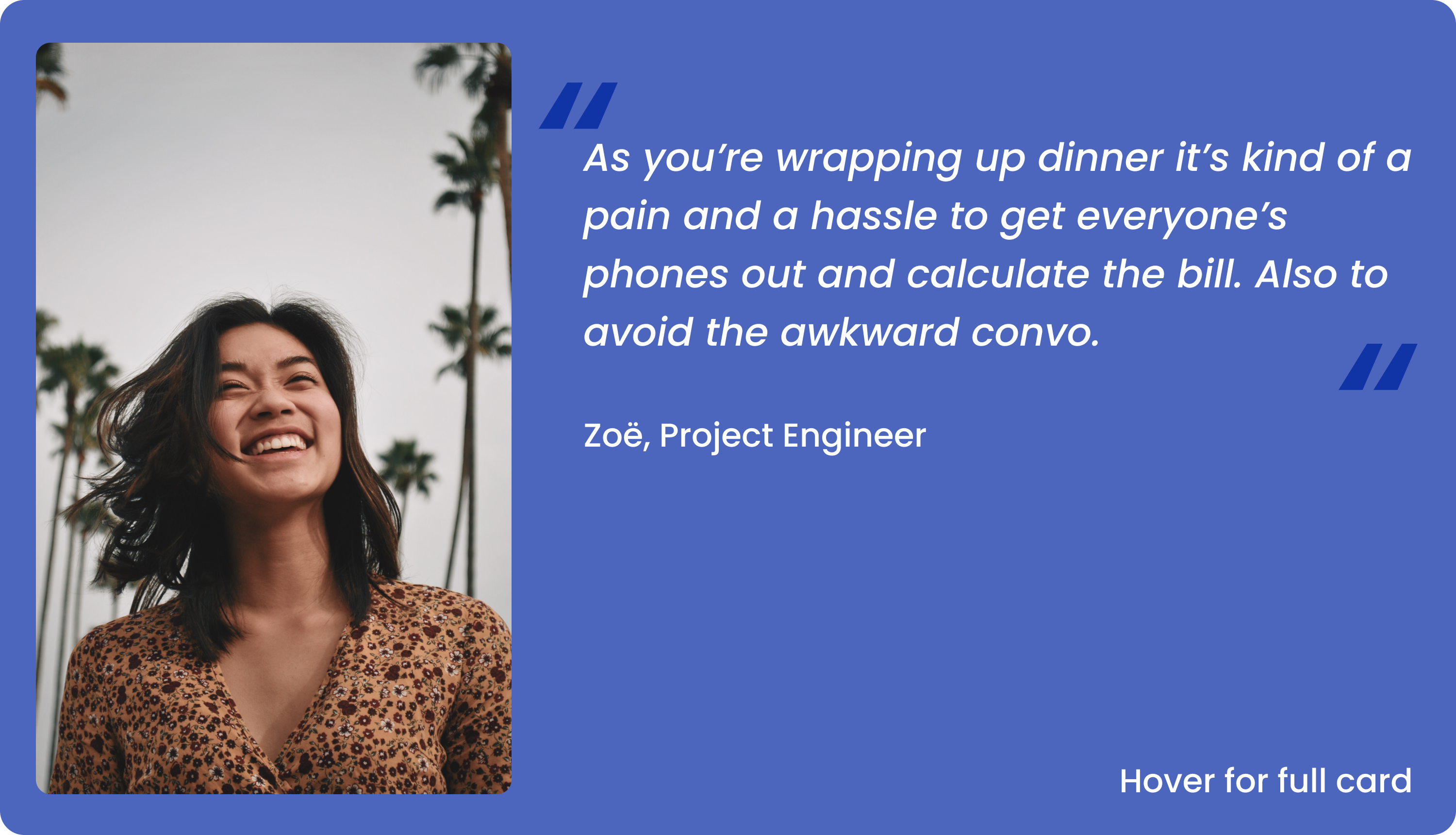
Zoë
Zoë represents young working adults who enjoy dining out with friends but feel stressed and awkward when splitting the bill at the end of meals. Despite being financially responsible, Zoë finds it tough to navigate the dynamics of group finances while dining, leading to uncomfortable situations and tested friendships.
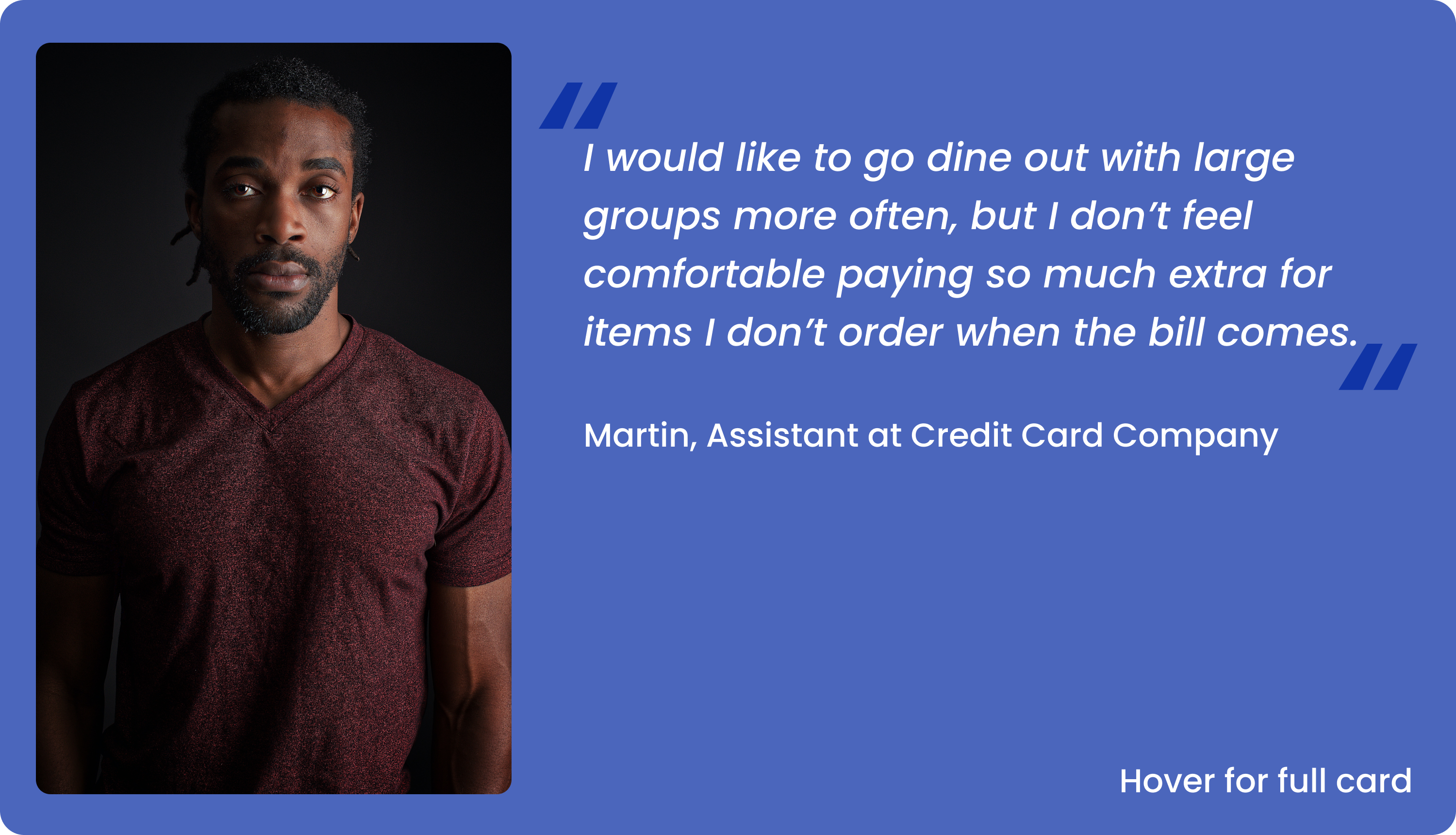
Martin
Martin represents working adults who enjoy socializing with friends but often avoid dining out with groups due to discomfort with splitting bills. With the responsibility of supporting his family, Martin carefully manages his personal finances and how much he spends ahead of time. When past situations have caused him to pay for more than what he ordered, now Martin often declines group dining invitations.

Insights
After gathering data from my research and analysis, including user personas I’ve been able to discover some of the main challenges for diners’ overall experience paying at a restaurant.
Finding 1
Time (Requesting Check)
Traditional payment of a restaurant check requires time spent waiting for waiters or waitresses to go back and forth with a check and credit cards to be used. Depending on how busy the restaurant is on a given night, this wait time can begin to frustrate some guests who are looking to get on with the rest of their day/night.
Finding 2
Time (Paying Check)
It’s a hassle and takes time away from the end of the dining experience for people to look at the bill and calculate what they ordered. “As you’re wrapping up dinner it’s kind of a pain and a hassle to get everyone’s phones out and calculate the bill.”
Finding 3
Friends Get Uncomfortable
Some users feel awkward and uncomfortable in group settings when the bill comes since not everyone has the same financial situation/status. When the bill is divided evenly, some users may pay for more than they ordered.
Finding 4
Inequality
When groups go out to dine together and the check is divided evenly, some people have to overpay for items they did not order simply to make it easier. This can create awkward emotions for people and discourage some from dining out with groups in the future. “I would like to dine out with large groups more often, but I don’t feel comfortable paying so much extra for items I don’t order when the bill comes. It makes me uncomfortable asking to divide the bill based on who ordered what.”
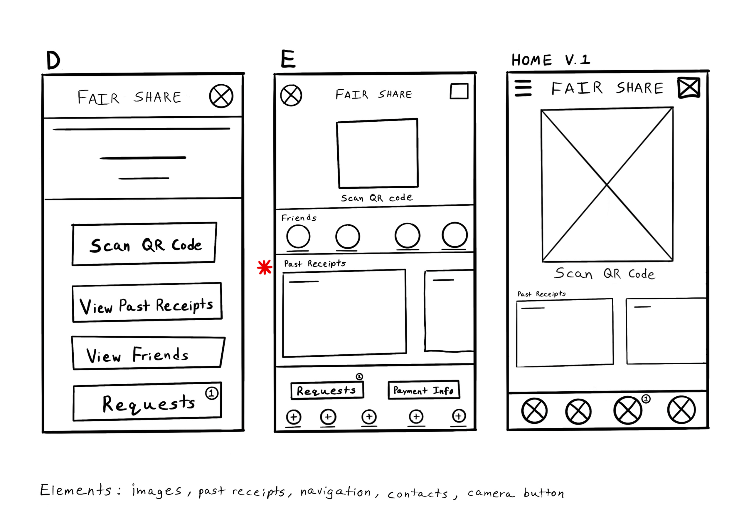
Sketches & Prototypes
Transitioning from paper to digital, these wireframes build on the early design ideas and user feedback about what features were important. It was also important to design an easy-to-view and read layout to help the user go through the process as easily and quickly as possible.
The low-fidelity prototype for the app shows the main user flow of splitting a group check and paying specifically for selected items from start to finish.
Refinements
During my usability studies, I noticed two key areas that could use some improvement and refinement. These unmoderated studies, conducted during the prototype stage, were super helpful in staying aligned with the main user tasks and keeping their needs front and center.
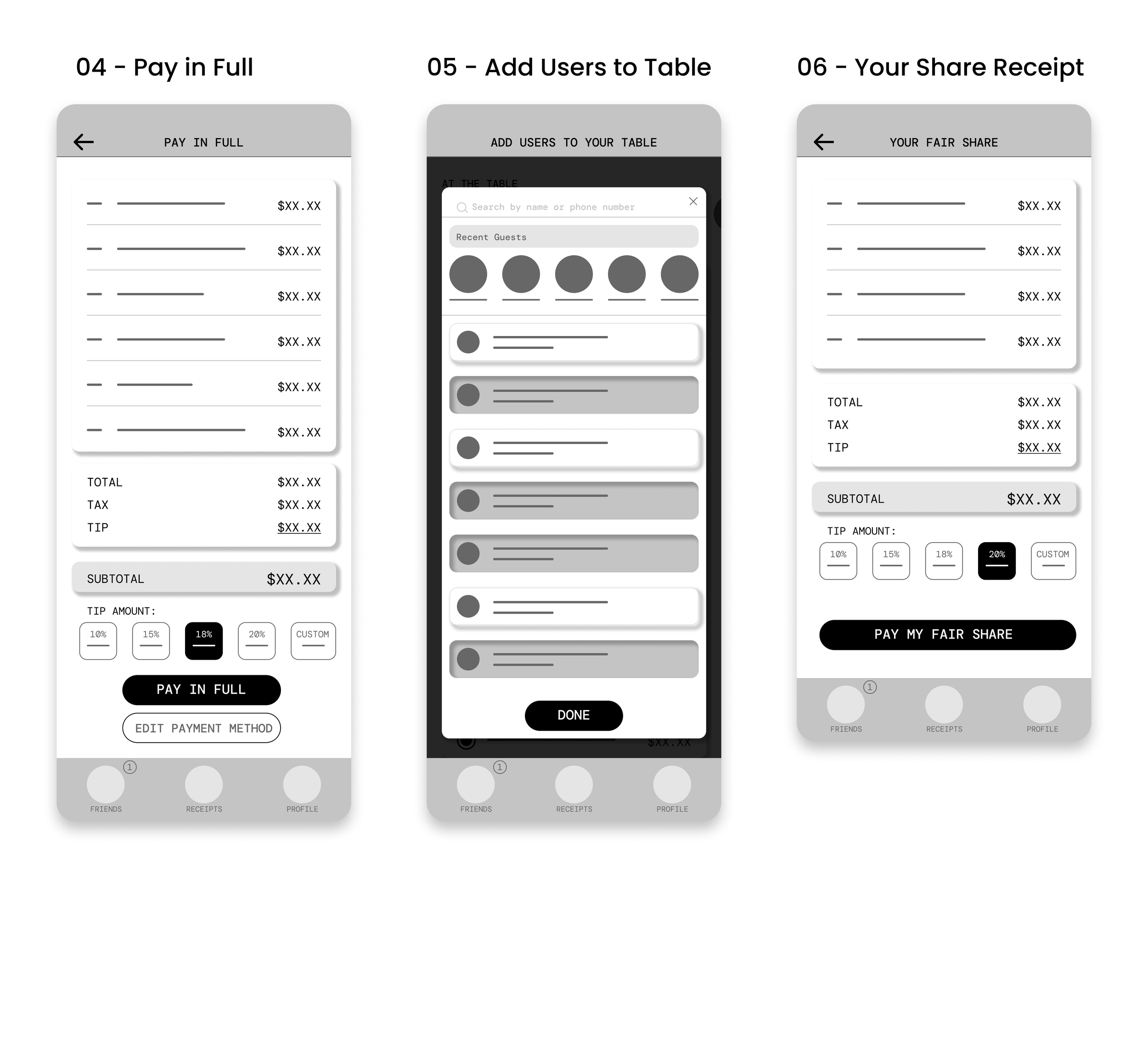
After a usability study of the high-fidelity prototype, users felt it was unnecessary to have an “Add Guests” feature. That screen was removed and instead, a different screen earlier in the user flow would simplify the process for users.
To make sure users knew what was a button vs important text, the “Subtotal” portion on the check screen was re-designed to differentiate from the typical button design by using a different color.
Goals
With a deeper understanding of the user needs and pain points, I established three main goals for the á la card app.
GOAL #1
A Simple and Efficient Payment Process
Provide a clear and straightforward process for paying the restaurant bill, whether dining solo or in a group. Remove the hassle and confusion typically associated with settling the check, ensuring a seamless and stress-free payment experience.
GOAL #2
Pay For Individual Items
Giving users the ability to select and pay for what they ordered can be a solution for those who feel uncomfortable with splitting the whole restaurant check evenly when dining out with a group. By only having to pay for what they ordered, all diners can feel fair and equal regardless of their financial situation.
GOAL #3
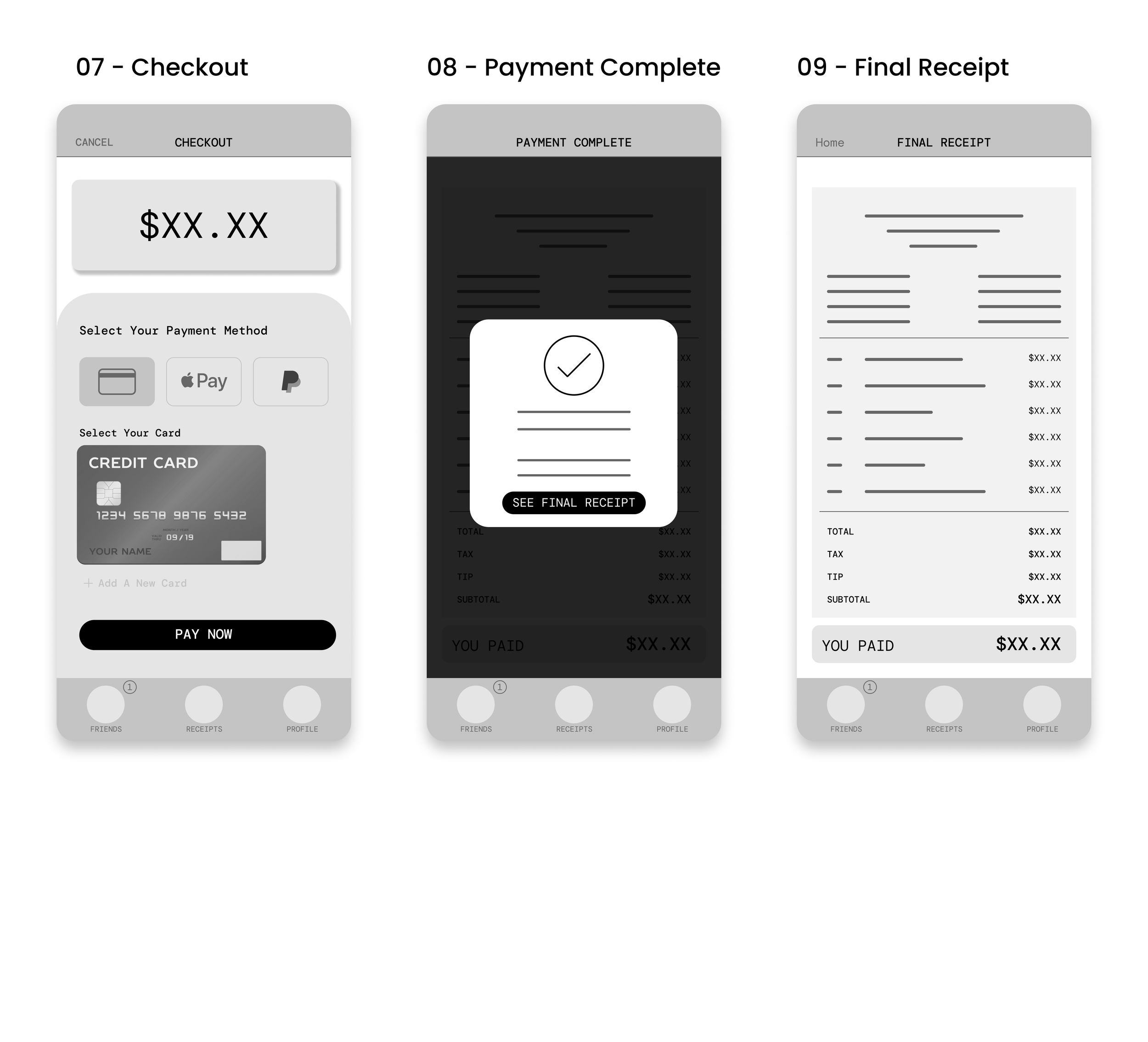
Save Digital Receipts
Enable users to easily track both the total bill and their individual portion, clearly showing what they are responsible for paying. This transparency ensures users feel confident about their contributions, reducing any potential confusion or disputes during the payment process.


Final Thoughts
While this app is not available in the real world, users from the usability tests found this app very useful and efficient for dining out experiences. One quote from a user was:
“If I was out with a group I feel like this would be ideal so everyone can quickly pay their amount of the bill without splitting things up in our own calculators or arguing on dividing the bill evenly"
What I’ve Learned…
I’ve learned that while features and options seem great for people to have, most users just want to be able to complete their tasks in the most efficient way.